The FWA (www.thefwa.com (duh)) is a great website. It gives weekly and monthly awards to inovative websites that push the boundries of internet content and interactivity. So where better to look for website research then here. I will give an overview of soem websites that I personaly like (and one that I don't like) to give me an understanding of what works well online.
"Pieces" Matt Titone online portfolio
This website is an online portfolio of the work produced by Matt Titone, a graphic designer and art director.
First impressions:
First impressions give a view of a simplistic website. Neat and compact with not to much cluter on screen. It is all very organised and well spaced out, perfect to me, as a user, to like.
Ease of use:
A menu system allows for the user to navigate differnt areas of the portfolio. All labeled and easy to gain access to. At anytime you wish to go to a different area, just mouse over the menu icon and submenus come out. Very hand, instead of having to keep going back and forward all the time.
Music sounds can become frustrating after a while with thier inevitable quirky beeping sounds when you click for the next page will start to get on your nerves. Luckly the creator has thought of this and allows the option to turn this off.
Realevnt:
A clean simplistic online portfolio means that the content itself must be good. This persons work is very good. As a graphics designer the art work that he produces is very professional and works well with a white background. This makes it stand out more.
Content organisation/Layout:
As I've said before, the layout is mostly simple with a well structured menu. Extra features that have been included to the design of the website have been that of a keyboard. You can scroll through the content of his portfolio quickly with keyboard shortcuts. I think this works well as the user has less to think about when it comes to where you have to click.
Design in regards to the brand/identity of company:
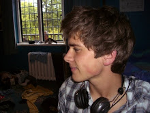
Portfolio works well as there is not much litter about the screen. However there is little to suggest an identity connection between the website and the portfolio creator. Only a picture at the begining of the person.
Thursday, 1 May 2008
Website research / the FWA / part 1
![]()
Subscribe to:
Post Comments (Atom)
0 comments:
Post a Comment