Hi to anyone who is actually looking at this blog. I’m afraid to say that this is the last post I will ever be doing on this blog!!! SHOCK! But for good reason. As you may or may not know I’ve started a new blog for my second year's work in AV production. Which can be found:
------------------>HERE<------------------
Thanks for looking at this blog, and hope to see you soon on my new one ^_^. Laters
Sunday, 23 November 2008
Okidokes! New blog people
Friday, 29 August 2008
Long time no see
I thought I would post upon what I've been doing recently as I haven't actually posted for quite a few months. Shocking I know.
Basically, like every other student, I've been working for my keep. Earning enough money working a full time job for the next year of university (can't wait). So as usual I haven't had a great deal of time to find some work experience. I have however been reading up on, and practicing my subject (multimedia ofc).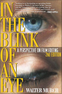
Ive also been practicing my "tool set" as my tutor likes to say. The online tutorials and playing around with different ideas has added to my knowledge. Recently Ive been using photoshop more and more. Il put up this example of my eye. I took this photo ages ago because I couldn't work out what colour my eye was (yeah I know silly really). My eye colour is a dull grey / green. So I thought I would play around with different techniques to boost the colour. To make this, I created multiple layers of the same image and choose overlay. This gave it a more colourful look. I then created a new layer and started subtly painting the eye with blues, greens, reds and yellows. Then by adding a Gaussian blur, it allowed me to meld those colours into the eye. So although the eye colour is changed, it doesn't look horrendously overdone. Click the image to get a bigger image and More detail.
Anywho, Soon I'l be starting my second year and I'l be moving into audio visual production, can't wait. I think I might create a fresh blog, bigger / better / bolder, to compliment my new work. It will come soon. Later.
Sunday, 1 June 2008
Finished Identities Interactive
I almost forgot to talk about my finished identities project. I had been so caught up in it's creation and getting it completed for the deadline, I completely forgot about writing up a finished post.
Overall I'll say firstly that I'm very happy with the outcome of this project. I took previous techniques that I had already used in other multimedia work and Incorporated them into this project. Techniques such as stop motion and a go-to-and-stop type of storyline for the flash. I was able to create an interface based on the guitar hero fret board. The 5 buttons each represented a different part of my identity that collectively makes up a picture about myself. These included: my avatar, multimedia / stopmotion, Music, Games and Juggling.
Being able to pick up software quickly, I was able to use flash to my liking. Not to say that it was easy at all, many times just one piece of code out of place took me ages to fix! Flash worked well for the task at hand.
By choosing to make my interactive more like stopmotion, flash could run the pictures smoothly in a coherent fashion to give what seems like animation. Although animation was not required for this part of the project, I did include previous work such as my avatar and its environment to prove I could used 3D studio max. That said, i didn't feel it neccecary to create animation for the movement of the fingers. By animation fingers it would have taken much longer and the finished effect wouldn't have been as good, personaly. This would have been due to me having to create the whole hand and fret board. Not a simple task.
On the downside, the only major problem I had was choosing where I should put the logo. It just didn't seem to fit in anywhere, user testing also confirmed this. So I decided to put it at the end. This seemed to work best.
I will try upload the complete intereactive, however I did not embed the video (instead a progressive download) because if I did the framerate would have been all wrong. But enough about excuses, the screenshots should give an idea for now. The upload will come soon, when I can work out where my server space is at the uni. It's really hard to find arg! But it will be up soon enough ^_^


More machinima css source
OK well, its not strictly machinima. Ive been making another counter strike source vid, to help along with my editing skills. I learnt a few things from this one which I didn't know before, so I would say the effort has been worthwhile.
Althought not strictly machinima, since it doesn't really have a story line, it still falls into this category. An extract from Wikipedia :
machine cinema, is a collection of associated production techniques whereby computer-generated imagery (CGI) is rendered using real-time, interactive 3-D engines, such as those of games, instead of professional 3D animation software. Engines from first-person shooter and role-playing simulation video games are typically used
Im just sorting out its compression right now so it will fit on youtube in a recognisable clip (because youtube resolution quite frankly is pants)
I have uploaded the high quality file here for anyone who wants to see it in its glory: http://files.filefront.com/testforcssidentitiesavi/;10446330;/fileinfo.html
As a matter of fact, filefront now has streaming capability, (personaly much better then youtube (one better then both of them was divix stage 6 until it got closed down because it wasn't popular enough, that one was AMAZING!)anywho...) So I will embed it below.
testforcssidentities.avi
Thursday, 1 May 2008
Website research / the FWA / part 2
Heres another website that caught my attention. http://bravia.sony.eu/bravia.html
. If you've seen the sony bravia adverts for thier tvs you'll know what im talking about. These are the people who have created some amazing adverts such as bouncing thousands of bouncy balls down the streets and making clay coloured bunnies come to life.
soz will finish this off soon.
Logo / Brand research
Since I will be adding a logo / brand to my interactive identity piece of work, I thought it necessary to look up a little on the subject before designing one myself.
The term "brand" actually comes from a Norse word "brandr" which means "to burn". This method was used by farmers who would brand and animal by burning a mark onto the skin. Therefore making identification easier.
"Today, branding is the process by which a company, a product name or an image becomes synonymous with a set of values and aspirations such as youthfulness, independence, quality or performance." quote from one of my lectures.
As brands progress they seem to get simplified:

I think this is ultimately a good thing. However, I think this progression is not always necessary, yes it must reflect on modern times and the modern world. But I think these have only been simplified because of the duration of time these logos have been around. As people make the association of the logo with the company, it’s then possible to edit the original to something more clean. For example shell, at first was represented by a shell. But overtime this shell has been simplified to something easy to remember. I think this is the key.
Website research / the FWA / part 1
The FWA (www.thefwa.com (duh)) is a great website. It gives weekly and monthly awards to inovative websites that push the boundries of internet content and interactivity. So where better to look for website research then here. I will give an overview of soem websites that I personaly like (and one that I don't like) to give me an understanding of what works well online.
"Pieces" Matt Titone online portfolio
This website is an online portfolio of the work produced by Matt Titone, a graphic designer and art director.
First impressions:
First impressions give a view of a simplistic website. Neat and compact with not to much cluter on screen. It is all very organised and well spaced out, perfect to me, as a user, to like.
Ease of use:
A menu system allows for the user to navigate differnt areas of the portfolio. All labeled and easy to gain access to. At anytime you wish to go to a different area, just mouse over the menu icon and submenus come out. Very hand, instead of having to keep going back and forward all the time.
Music sounds can become frustrating after a while with thier inevitable quirky beeping sounds when you click for the next page will start to get on your nerves. Luckly the creator has thought of this and allows the option to turn this off.
Realevnt:
A clean simplistic online portfolio means that the content itself must be good. This persons work is very good. As a graphics designer the art work that he produces is very professional and works well with a white background. This makes it stand out more.
Content organisation/Layout:
As I've said before, the layout is mostly simple with a well structured menu. Extra features that have been included to the design of the website have been that of a keyboard. You can scroll through the content of his portfolio quickly with keyboard shortcuts. I think this works well as the user has less to think about when it comes to where you have to click.
Design in regards to the brand/identity of company:
Portfolio works well as there is not much litter about the screen. However there is little to suggest an identity connection between the website and the portfolio creator. Only a picture at the begining of the person.
Subscribe to:
Posts (Atom)